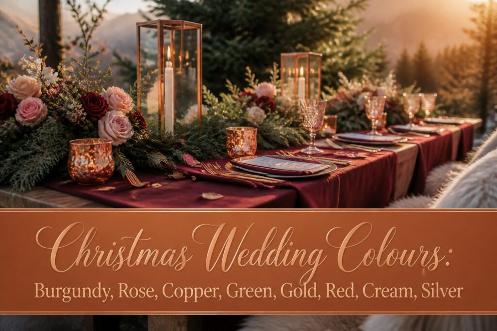
Christmas wedding colours are the specific palette choices that keep a December ceremony from looking like a holiday party that forgot it was a wedding.
The trap is letting one shade dominate every surface; a single strong application of burgundy, carried through the bridal party dresses or the table linens, reads as styled where the same colour spread across flowers, cake, and stationery turns themed.
One couple spent a year gathering copper frames and lanterns until their spare room overflowed, building a palette piece by piece rather than in one overwhelming décor order.
Burgundy
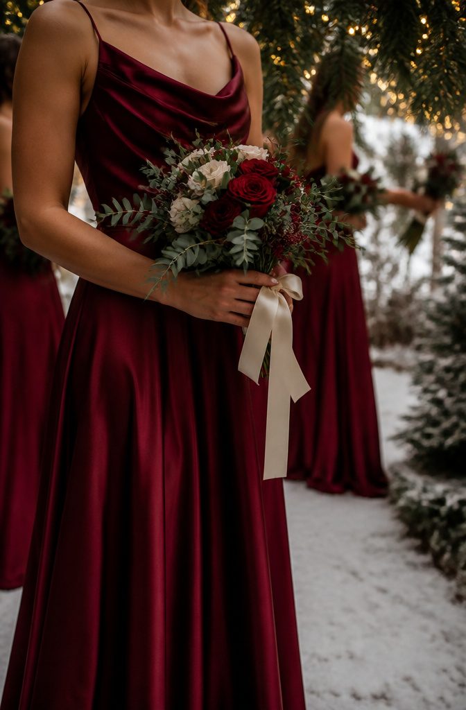
Burgundy carries a depth that flat reds cannot manage, and that depth matters under winter light.
Three separate wedding color guides name it among the most requested shades for cold-weather ceremonies, which tracks with what I have seen in portfolio after portfolio from December through February.
The color reads warm against skin and reads expensive against nearly any backdrop, two qualities couples are usually paying to achieve.
Pairing it takes some care. Navy suits with burgundy ties show up reliably in groomsmen lineups, a combination that photographs cleanly without looking like a holiday advertisement.
For the surrounding palette, gold and deep green keep the mood seasonal without pushing into literal Christmas territory, while cream or silver can step in when you want to cool the overall effect down.
The risk with burgundy is letting it dominate too many elements at once; one strong application, usually the bridal party dresses or the table linens, carries the whole scheme.
Spread it across every floral arrangement, the cake, and the stationery, and the wedding starts to look themed rather than styled.

10FT Burgundy Table Runner: Our burgundy cheesecloth table runner is measure 35 wide x 120in(10ft) long, can be perfectly and gracefully placed on the table and hung on the floor, which will add a romantic atmosphere to your christmas.

Size: 29" W x 120" L. Please allow tiny color difference due to different screens.
Size: 29" W x 120" L. Please allow tiny color difference due to different screens.
Dusty Rose
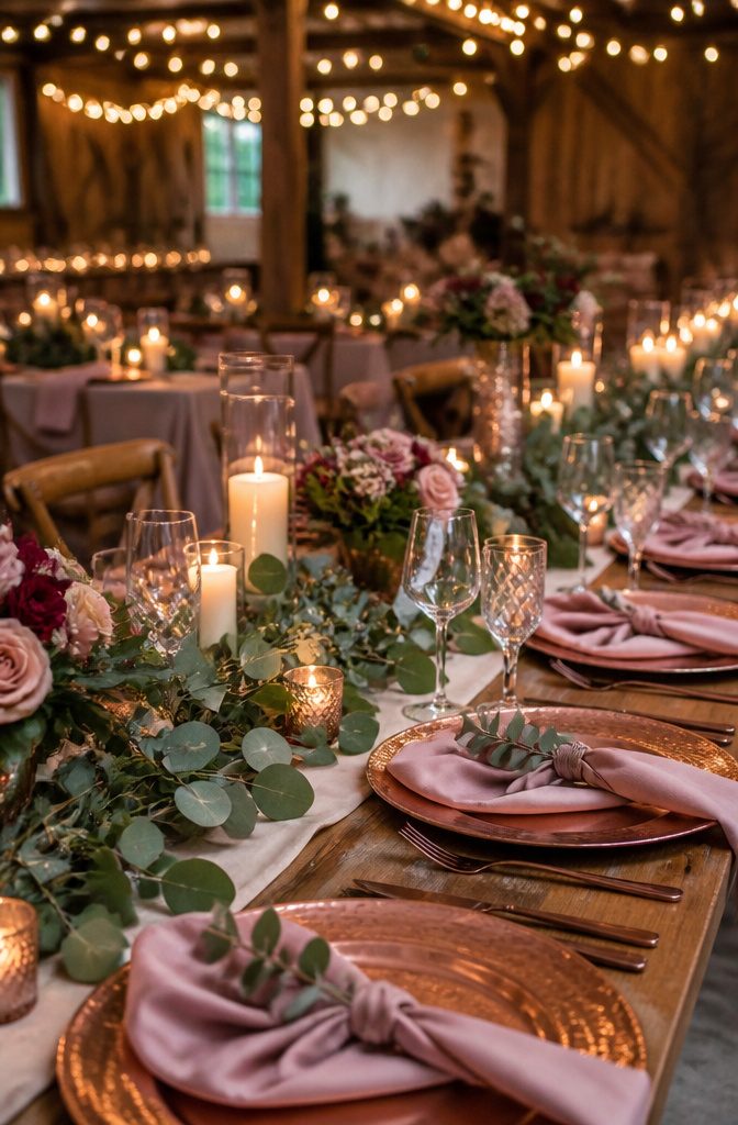
Dusty rose has pulled ahead of the bubblegum pinks that dominated the ’80s, with searches for "dusty pink weddings" climbing 255 percent in a single year.
That spike tells me couples are after something softer than the Pepto-Bismol shades their mothers might have chosen.
The muted tone reads romantic without shouting, which matters in a Christmas wedding where bolder colors compete for attention.
Against deep greenery, it does something better than pure pink could: it recedes just enough to let the green read as lush rather than merely decorative.
I have seen tables where dusty rose napkins and candles sat against garlands of seeded eucalyptus, and the effect was garden-seasonal rather than craft-store seasonal.
Couples are gravitating towards a more muted tone called "dusty rose."
What this means for your palette: dusty rose earns its place as the quiet member that lets your greens and metallics do the loud work.
It is a bridesmaid dress color your party might wear again, which softens the per-wear cost if they are buying their own.

SMOOTH SATIN NAPKINS: Satin cloth napkins are made of high-quality 100 percent polyester (satin fabric). Silky satin napkins has a smooth touch with charming and shiny colors, you can fold out various shapes according to your ideas. Machine washable, reusable, not easy to wrinkle and fade.

Sold in packages of 100 Napkins. Buy quantity 1 = 100 napkins How to Care: Warm water wash, Do Not Bleach. Low temp dry. Material: 100% polyester, stain & wrinkle resistant. Approximate Measurements: 17" x 17" size If napkins are opened / used - Item will not be eligible for exchange or refund.
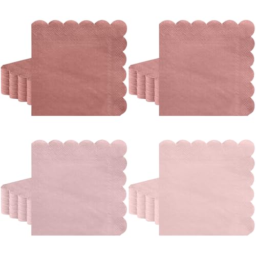
【You Will Get】The package contains 120 pack dusty pink napkins, which are enough for your daily life or party time. Pink scalloped napkins suitable for dinner, cocktail, beverage and other drinks.
Copper
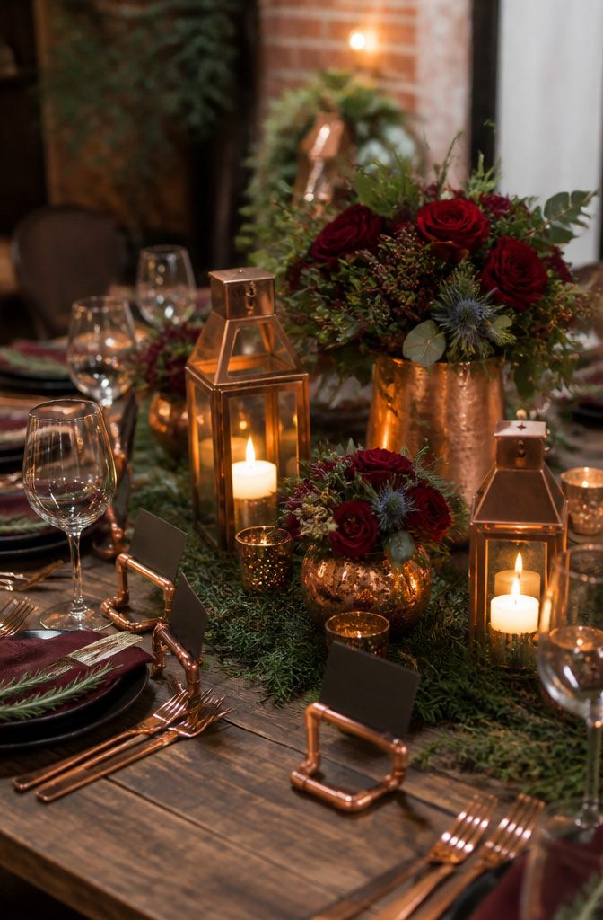
Copper warms up a Christmas palette without stealing attention from deeper tones like burgundy or forest green.
The metal sits right in that space between gold’s flash and silver’s coolness, catching candlelight in a way that reads festive rather than formal.
A couple who planned their own barn wedding spent months collecting copper frames and lanterns before they ever had a venue fully dressed.
They eventually gathered enough for centerpieces, including copper terrariums, and kept going until spare room storage became an issue.
That kind of gradual accumulation works for budget-conscious planning, you can buy a piece here and there instead of one overwhelming décor order.
Copper looks expensive in person, and it photographs even better. Copper pipe, bent and cut, became the raw material for 100 name card holders at a fraction of retail cost.
Pair that with wooden elements, maybe a handmade frame for the seating chart, and the metal starts to feel grounded rather than trendy.
For a late-December wedding where most of your color comes from evergreens and deep reds, copper gives you sparkle without the formality of gold.

VINTAGE SQUARE CANDLE LANTERN - DECORKEY large square farmhouse lanterns are hand painted with a distinguished, rustic metal finish effect. Beige & copper metal with glass features a distressed brushed look. Retro design will add classic beauty and create an elegant look which is perfect to use year after year, even with the ever-changing trends. Just add a tealight candle or flameless LED and this piece radiates light through textured glass for a calming glow and enjoy a peaceful day.

【Mini Size】:The decorative candle lanterns dimensions are designed to be 5 inches height(Note:Plus the hanging loop is 6 inches height) and 2.5 inches in diameter and mini lantern with tapered flameless candle table centerpieces are small lightweight lanterns, making them more portable and cute.

Delicate Mini Lanterns: Hexagon Moroccan style candle lantern with 6 clear glass panels and use high quality bead to light up your table. Cute dimension(2.6"D x 4.7"H), candle lanterns equipped with flameless candles, no fumes, smell and fire, no fire hazards or burning risks, can be used anywhere
Deep Green
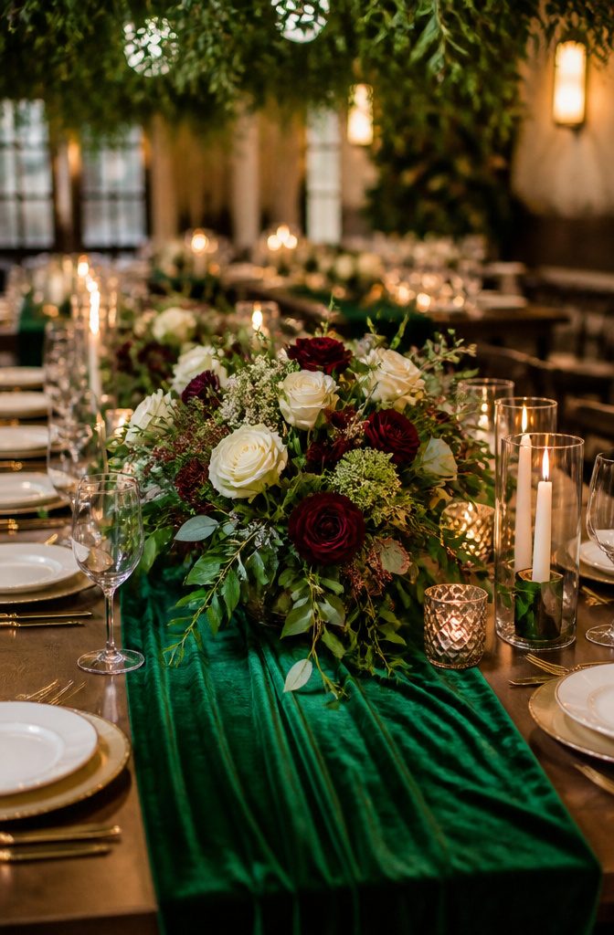
Deep green carries the weight of winter woods without ever feeling heavy.
Against the bright reds and golds that dominate most Christmas palettes, it acts like a shadowed corner of the room, the place your eye rests after the candlelight and tinsel.
I learned this the hard way at a cousin’s reception where every surface competed for attention; the tables with evergreen runners were the only ones guests lingered at.
Green works best when you treat it as the structure, not the decoration. Think velvet napkins, eucalyptus garlands, or a bridesmaid dress in forest satin rather than a centerpiece that tries to be the whole story.
It grounds burgundy without dulling it, cools copper before it turns brassy, and makes cream look intentional rather than leftover.
For budget couples, this is practical. Greenery from a wholesale flower market costs a fraction of dyed blooms, and potted spruce or pine can move from ceremony to reception to your own porch afterward.
The color does the seasonal work so your spending does not have to.

【PURCHASE CONTAINS】Silk Green Gold Paisley Vest+Necktie+Lapel Pin+Pocket Square+Cufflinks+Tie Clip.It's Proper gift for Christmas Day, Valentine's Day, Thanksgiving Day,Father's Day, Anniversary,birthday ect

Premium Quality: The plastic plates are BPA free, food grade plastic and heavy weight plastic. Durable and stable product quality effectively prevents breakage and bending, great for any kind of meal. The green plastic plates for party, are designed with smooth edge and shiny decent color so that ensures a safe and happy eating experience.

【Ideal Quantity and Size】: You will receive 30 pieces of dark green artificial pampas grass, each measuring 24 inches in length. The full and fluffy appearance strikes a perfect balance between elegance and practicality. The tall pampas grass decor adds an eye-catching element to any room while still maintaining a manageable size for versatile placement.
Gold
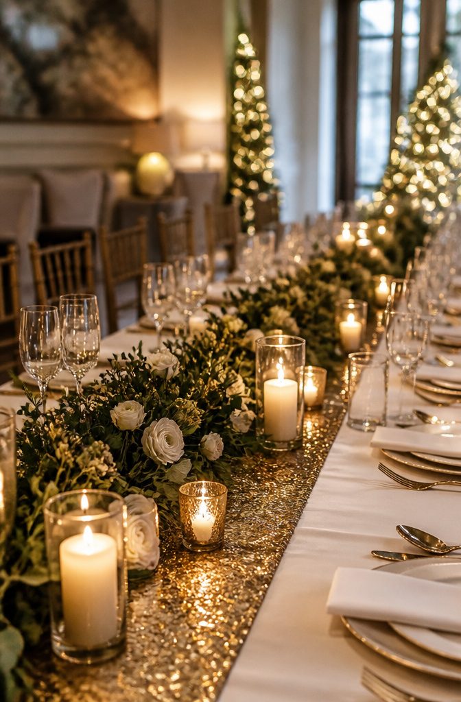
Gold behaves like candlelight made solid: it warms a room without any bulb switched on. At a December wedding, where daylight disappears early and the night arrives close to 5:00 PM, that quality matters more than it would in June.
I have seen a single gold runner across a white cloth pull the whole table toward the fireplace even when the fireplace was unlit.
The mistake is using it everywhere.
A little gold reads as luxury; a lot reads as casino. One reliable way to keep it in check is to treat it as a connector rather than a surface.
Gold-rimmed glassware, the thin edge of a charger plate, or the thread in a napkin ring catches the same light that makes fairy lights feel magical, but it leaves the heavy lifting to deeper colors like burgundy or deep green.
Candlelit décor already brings its own flicker; gold just gives that flicker somewhere to land.
Metallic spray on bare branches, set low in centerpieces so they stay below eye level, adds the sparkle of Gibraltar’s Christmas lights against twilight without demanding a centerpiece of its own.
The branches do the work once, and the gold keeps doing it as the room darkens.

You will get 12 bundles of burgundy peonies artificial flowers, suitable for daily home decor or DIY wedding decorations.

Festive Sparkle for Your Decor: add elegance with 10 Christmas Glitter Leaves; Suitable for Christmas tree, wreaths, garlands, or floral arrangements, bringing a vibrant holiday charm to any setting

BEAUTIFUL FAKE FALL FLOWERS: Pack of 5 pcs lush fall Burgundy babys breath artificial flowers. The fall stems for vases blossoms with hundreds of tiny flowers, artfully creating dense bouquets that offer a gentle, refined enhancement to any floral composition or decorative niche.
Red
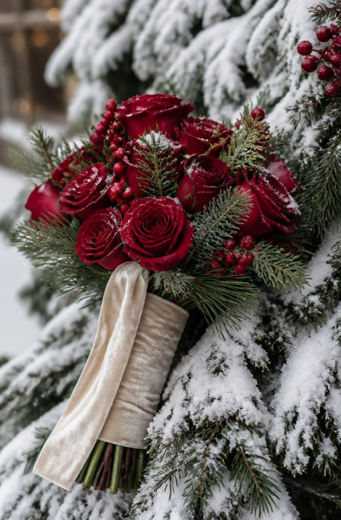
Red carries a Christmas wedding with energy that no other color quite matches, but that same strength can swallow a room whole if you let it.
At a winter wedding I photographed in Pennsylvania, the florist at Memories & Bloom built the bridal bouquet from deep red roses against cream velvet ribbon, and the result had warmth without the shout of an all-red tablescape.
The roses did the work of carrying the holiday feeling; everything else around them stayed quiet.
Red needs a boundary to keep it from taking over. Use it where hands and eyes land: the bouquet, a single runner, the groom’s boutonniere.
Surround it with soft lighting and neutral textures so the color reads as romantic rather than theatrical. A little red goes the full distance when the rest of the palette knows to step back.

Package: Contains cotton napkins for table decor.

Premium Material: Softalker tablecloths are made of 100% premium microfiber fabric, soft, durable, and designed for long-lasting use. Perfect for protecting and decorating your dining table.

MATERIAL: The table runner is made of high quality velvet, soft and smooth, not easy to wrinkle and shrink, no pilling and fading, no peculiar smell. Excellent wrinkle resistance, elasticity and dimensional stability.
Cream
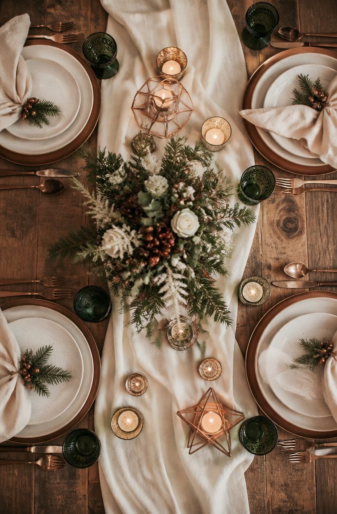
Cream is the quiet workhorse of a Christmas palette, the color that lets burgundy read as rich instead of loud and keeps gold from tipping into gaudy.
I learned this the hard way at a holiday open house where every surface competed for attention: red napkins, green chargers, gold-rimmed plates, and the whole room felt like a department store window rather than a dinner table.
The host had left no neutral ground for the eye to rest.
Cream performs that rest. It functions as negative space you can actually use, carrying the same warmth as white without the sterile chill that fights against candlelight and pine.
In a wedding context, this matters because your photographs will mix artificial venue lighting, flash, and whatever December sun filters through windows at 4:30 PM. Cream absorbs that mixed light evenly where pure white would blow out or turn blue.
Use it for table linens, the body of invitations, or bridesmaid dresses if you’re running multiple colors through your party.
It recedes just enough that a copper accent or deep green boutonniere becomes the intentional focal point you planned, not one more item in a crowded field.
The risk is choosing a cream with too much yellow cast, which can look like aged paper against crisp winter whites.
Hold your fabric sample next to true white and a warm beige; the right cream should feel distinct from both without clashing with either.

Size: 50 Bulk cloth napkins, each measuring 21" x 21". Available in a variety of elegant colors and patterns to match any table settings.
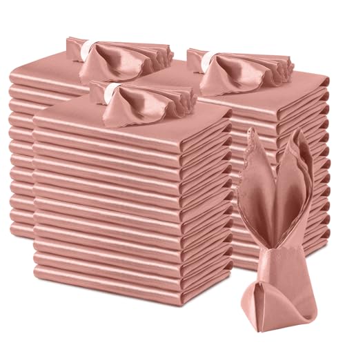
Smooth Satin Napkins: Satin cloth napkins are made of high-quality 100 percent polyester (satin fabric). Silky satin napkins has a smooth touch with charming and shiny colors, you can fold out various shapes according to your ideas. Machine washable, reusable, not easy to wrinkle and fade.
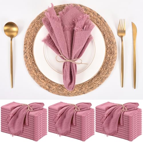
【Cloth Napkins Package】Upgrade your dining experience with our 36 pack handmade fringed cloth napkins! Each napkin measures 16x16 inches, making it the perfect size for everyday use or special occasions. The delicate 0.5-inch hand-pulled fringe on all four sides adds a touch of elegance, while the dusty rose color complements any table setting. Whether it’s a casual family dinner, a wedding, or a picnic, these napkins are designed to impress. With 36 pieces in each pack, you’ll always have enough to meet your daily needs or host larger gatherings.
Silver
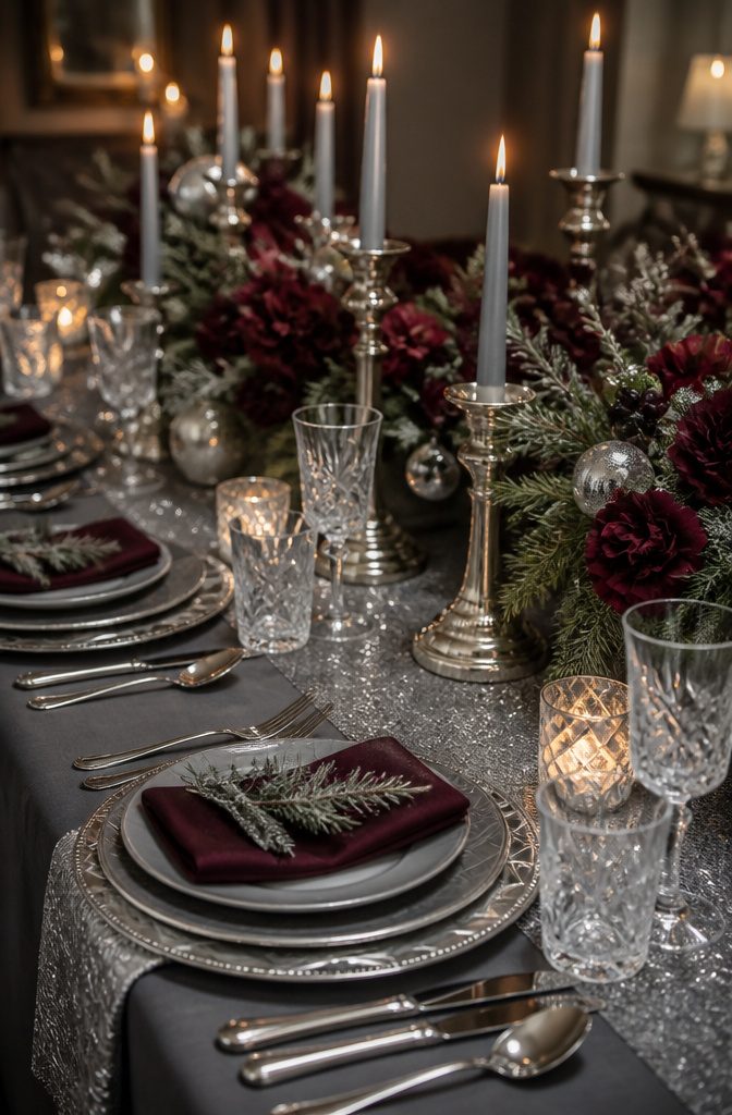
Silver catches light differently than the warmer metals, and in a December wedding that difference matters.
Where gold reads traditional and copper leans rustic, silver carries a cooler, more contemporary edge that pairs with snow, ice, and bare branches without trying to look cozy.
It works best when you want the metallic to feel like part of the winter landscape rather than a holiday decoration laid on top of it.
I have seen it go wrong when too much silver piles up. Chrome chair sashes, silver sequined table runners, and metallic-painted centerpieces all competing in the same room turn cold fast.
The fix is to let silver do its job in two or three places and keep the rest matte. Slate gray linens, frosted greenery, or bare wood hold the metallic steady so it reads as intentional, not accidental.
Against a Christmas palette, silver sits naturally with deep green and burgundy, but it also opens up combinations that gold would warm too much.
Pair it with dusty rose and the result feels modern rather than vintage. Add cream and it stays crisp instead of drifting toward antique.
The risk is sterility.
Silver needs texture, something handmade or organic, to keep a wedding from looking like corporate event décor. A single rough element, wool or velvet or unvarnished wood, usually does it.

Battery Operated String Lights: Powered by 3*AA battery (batteries NOT included). The battery box is not waterproof, please keep it away from water

Quantity and Size: you will receive 8 pieces of lantern candle holders and 8 pieces of flameless decorative LED candles; Each lantern holder measures approx. 10.6 x 5.5 x 5.5 inches/ 27 x 14 x 14 cm and each LED candle is about 5 x 3 x 3 inches/ 12 x 7.5 x 7.5 cm, proper size for you to use

Package Include: you will receive 12 pieces of wooden candle lanterns and 12 pieces of flameless decorative LED candles, which are ideal for a housewarming or wedding present; This wedding centerpieces for tables combination is nice to meet your wedding party decoration needs, you can also share them with others
Color Pairings That Work
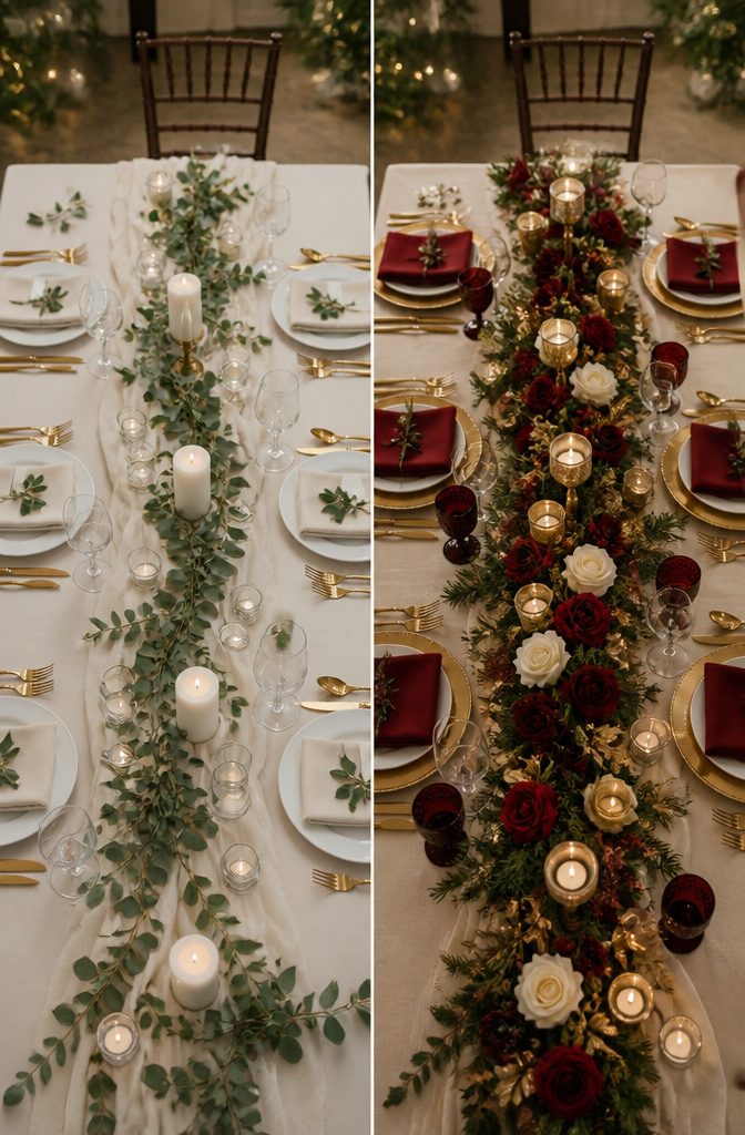
Most guides list single colors and leave you to guess what sits next to what. The pairings that actually hold up start with burgundy and gold, which reads as intentional rather than accidental.
The deep red carries weight; the metallic keeps it from turning funereal. I have seen this work in candlelit spaces where the gold catches what little winter light exists and bounces it back against the darker shade.
Dusty rose with deep green and cream solves a different problem.
The rose on its own can feel too spring, too light for December. The green grounds it, and the cream keeps the two from fighting.
A couple I photographed spent months hunting copper frames and lanterns after settling on blush pink, burgundy and copper; the copper acted as the bridge, a warm third tone that kept the pink from drifting too soft.
Their spare room filled with the collection over a year, proof that a palette needs objects to become real.
Red and silver risks looking like a department store aisle unless you mute one of them. Cream as the dominant field, with red in the flowers and silver only in flatware or candlesticks, keeps the combination from shouting.
Green and copper does the opposite work: the copper warms the green toward antique rather than evergreen cliché, and the pairing needs no third color to feel complete.
【100% PURE SILK SCARVES & SGS CERTIFIED】Crafted from premium 100% mulberry silk and SGS tested for quality, this pure silk scarf for women is lightweight, breathable, hypoallergenic, and skin-friendly with a natural lustrous finish. Suitable for year-round wear, the silk scarves keep you cool in summer and warm in winter.

【Stylish & Versatile Christmas Ornaments】: Boasting shiny, matte, glittering, and hand-painted finishes, these ornaments elevate tree decor effortlessly while blending seamlessly with any holiday theme.

Seasonal Decor
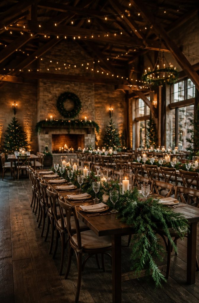
Greenery does the heavy lifting in a Christmas palette, and I have seen it go wrong when couples treat it as filler instead of structure.
At one December wedding I photographed, the florist ran garlands of real pine along the reception tables with nothing beneath them, and by hour three the needles browning against the white linen made the room look tired.
The fix is simple: build greenery up from the base, not down from above.
A low runner of seeded eucalyptus or fir on the table itself, with candles set into it in glass holders, gives height to the color without the wilt.
Fairy lights work best when they are not the main event. I string them inside greenery arches or wrap them around staircase banisters so the light catches the metallic tones, gold or copper or silver, rather than competing with them.
Candles are the same: a cluster of three heights on a mantel or windowsill, never one lone taper floating in empty space. The glow needs something to bounce against, stone or wood or the deep green of a wreath.
Placement matters more than quantity. A ceremony space with poinsettias grouped at the altar steps, where guests actually face them, outperforms the same flowers scattered on every other pew end and forgotten.
The budget you save by concentrating the impact in two or three spots pays for better greenery where it counts.

Give you a memorable wedding: This artificial flower combo combines orange and burgundy perfectly, and there is also some blue buds and exquisite gold pearl and leaves, very suitable to make bridal bouquets, centerpieces, floral arrangements, wreaths, cake decorations in your wedding.

Elegant Design: The flower wrapping paper features a wine red background and gold border design, providing a smooth and comfortable touch. The lightweight and sturdy nature of paper ensures a delicate appearance, making it the perfect choice for bouquet packaging

Premium Material & Size: The artificial flower balls are made of soft silk roses with high-quality plastic greenery. The flower ball is approximately 9” D x 4.3” H. Each flower ball has a patented base with a diameter of 3.12”. The fake flowers belong to a variation on our top-selling wedding bridesmaid bouquet. These artificial flowers are perfect for wedding centerpiece table decorations which will add flare in your highlight moment.
Floral Arrangements
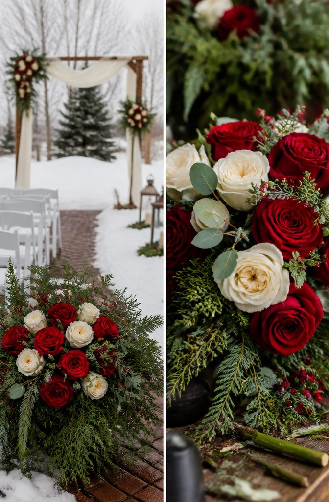
Seasonal blooms anchor a winter bouquet in a way forced summer flowers never quite manage.
Red roses hold up beautifully in December, their stems sturdy enough for outdoor photos and their color deep enough to read against a white dress or a grey sky.
I have seen brides pair them with burgundy ranunculus or cream garden roses, but the red carries the arrangement even when nothing else is in season.
The question most couples bring me is which flowers will actually be available.
Local growers in the Midwest finish their last dahlias by early November, so December weddings rely on greenhouse roses, anemone, and forced amaryllis, plus whatever evergreen foliage a florist can forage.
That limitation is not a compromise so much as a direction. A bouquet built around what is growing now looks intentional; one fighting the season looks expensive and still slightly wrong.
Ask your florist which stems they are ordering fresh that week, not which ones they can source with enough advance notice and enough budget. The answer tells you whether you are designing within the season or importing around it.
Venue Selection
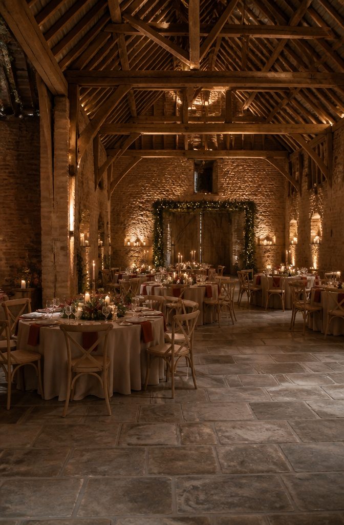
A barn with exposed brick and overhead beams already carries half the winter mood on its own.
Shustoke Farm Barns worked that way for the couple who chose it, the rustic structure doing enough heavy lifting that blush pink, burgundy and copper felt like a natural extension rather than a forced theme.
Venues that already read Christmas need less color help, which means your budget for extras drops and your risk of overdecorating shrinks.
Churches can work the same angle if they keep their seasonal greenery up through your date, though the effect varies week to week.
I have learned to sort venues into two piles fast: the ones where a single garland would feel like too much, and the ones where even substantial decor looks like a rescue mission.
The first group is smaller than couples expect.
A space with warm wood tones and existing architectural texture rarely needs bold red or full metallic schemes to signal the season; softer palettes like cream and dusty rose hold their own without competing.
Spaces that read neutral year-round, by contrast, demand stronger color commitments and more rental pieces to reach the same atmosphere. The mistake is assuming every winter venue wants the same intensity of scheme.
Frequently Asked Questions
What are the best colors for a Christmas wedding?
Burgundy, dusty rose, copper, deep green, gold, red, cream, and silver all work well for a Christmas wedding. Copper sits between gold’s flash and silver’s coolness, and deep green acts as structural grounding rather than decoration.
How can I incorporate seasonal decor into my wedding?
Build greenery up from the base with low runners of seeded eucalyptus or fir, and set candles into glass holders within the foliage.
String fairy lights inside greenery arches or wrap them around banisters so they catch metallic tones rather than competing with them.
Group seasonal elements like poinsettias in one or two concentrated spots rather than scattering them thinly across the whole venue.
What flowers should I choose for a winter wedding?
Red roses hold up well in December with sturdy stems for outdoor photos and color deep enough to read against a white dress.
Burgundy ranunculus and cream garden roses pair with them nicely. Skip forced summer flowers; local Midwest growers finish dahlias by early November, so December weddings work best with greenhouse roses, anemone, forced amaryllis, and foraged evergreen foliage.
What are some good wedding colors for December 2026?
The same palettes working now will hold for December 2026: burgundy and gold for candlelit spaces, dusty rose with deep green and cream for softer atmospheres, and green with copper for a pairing that needs no third color.
Silver carries a cooler, more contemporary edge that pairs with snow and bare branches without trying to look cozy.
What colors are good to wear to a December wedding?
Navy suits with burgundy ties show up reliably in groomsmen lineups and photograph cleanly without looking like a holiday advertisement.
Bridesmaids in dusty rose get a dress they might wear again, which softens the per-wear cost. For guests, cream absorbs mixed winter light evenly where pure white would blow out or turn blue in photographs.
What is the in-colour for weddings in 2026?
Dusty rose has already pulled ahead of bubblegum pinks, with searches climbing 255 percent in a single year as couples gravitate toward muted tones.
The color reads romantic without shouting, which matters in a Christmas wedding where bolder colors compete for attention. Against deep greenery, it recedes just enough to let the green read as lush rather than merely decorative.